Illustration Flaws
- Caroline

- Dec 17, 2016
- 1 min read

What I love about illustration is you can get away with a lot of flaws. A picture has to be just right but with drawing and painting, you can take a lot of liberties.
For example, even though people (usually) do not have perfect circles of blush on their cheeks, an illustration can pull it off effortlessly.
Also, a picture has to have just the right lighting, but you can create your own lighting when you draw/paint something.
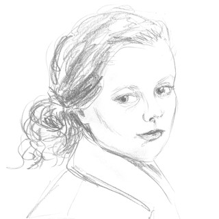
Even the hair in this illustration looks quite undone by itself. But since the rest matches that in style, it somehow works.
There may be many small mistakes to the artwork itself, if one is critical, but altogether it can give an illustration charm and character 🙂
Let me know if you agree!


Comments